As a creative web agency, one question we get asked a lot during the design phase is ‘what is a responsive image and why does my image crop on different screen sizes’? So we thought, lets write a blog post to explain exactly what is meant by ‘responsive’ and explore the all elusive cropping image.
Before we begin to explore responsive web design, let’s take a step backwards and define the word Responsive itself…courtesy of the Oxford Dictionary.
‘Responsive’
Reacting quickly and positively:
A flexible service that is responsive to changing social patterns
Broken down, being responsive means you adjust and adapt quickly to the situation, which is exactly how a responsive website should work. Adapting in response to the users device, to showcase content in the most seamless way possible. As responsive elements go, images are particularly important, as in the short term they communicate more effectively than text on a web page.
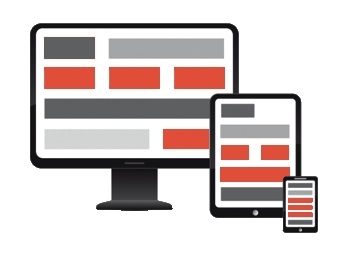
We’ve created the below graphic to illustrate how the modules of a responsive site might adapt across different devices, along with a step by step walk through of the process.

- The website is built with a device first approach (mobile in this example).
- The mobile view represent the best organisation of content – and offers the best space to view the content on.
- As the device size is increased, so is the space that the content can fit within.
- The same amount of content for mobile must be re-organised to fit the new, larger space.
- Content and design modules are re-ordered and re-sized to fit the space.
- The same process is repeated as the space increases device to device, all the way up to desktop.
- The coloured blocks in the graphic reflect how a fixed module change cross device.
So, now we understand how a responsive website works, let's talk about images. Images on a website tend to work in two ways, they will either:
1) sit in a fixed width space and the images aspect ratio will reducevwithin that space, or
2) The image will sit on a website and the width or height of the image will be cropped as the page size reduces.
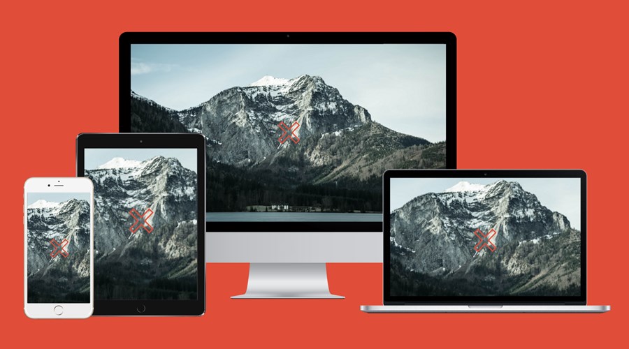
Point two is the slightly more complicated route to understand and is illustrated by the hero image at the top of this blog post (it's no coincidence that the graphic has 'x' marks on it!).
When it comes to editing your website through our CMS (or any), you may upload a new background image or large feature image and find at different screen sizes the image is cropped differently, it may not show everything you want to see. 'Why' I hear you asking?
The key to making your images as consistent as possible, across all devices is making the centre the focal point of the image (displayed by the cross x). Most admin systems will default to the centre of the image as the cropping identifier for re-size. You will see in the example, the image is cropped for each device but always maintains the same focal point, the middle of the image.
It’s down to you as the user to choose an image that will work best within the space, the example only shows once scenario of how an image may be cropped, but of course, the focal point may need to be adjusted if the image requires it. In this instance, it is likely your development team will need to make the change on an image by image basis.
Happy editing all and keep those images as optimised as possible to see improved web perfomance across all devices.


