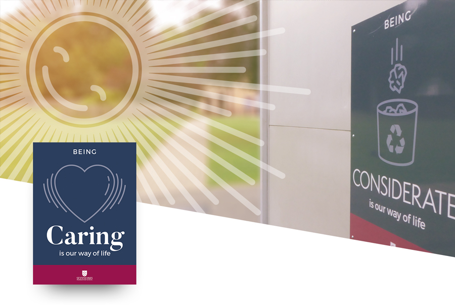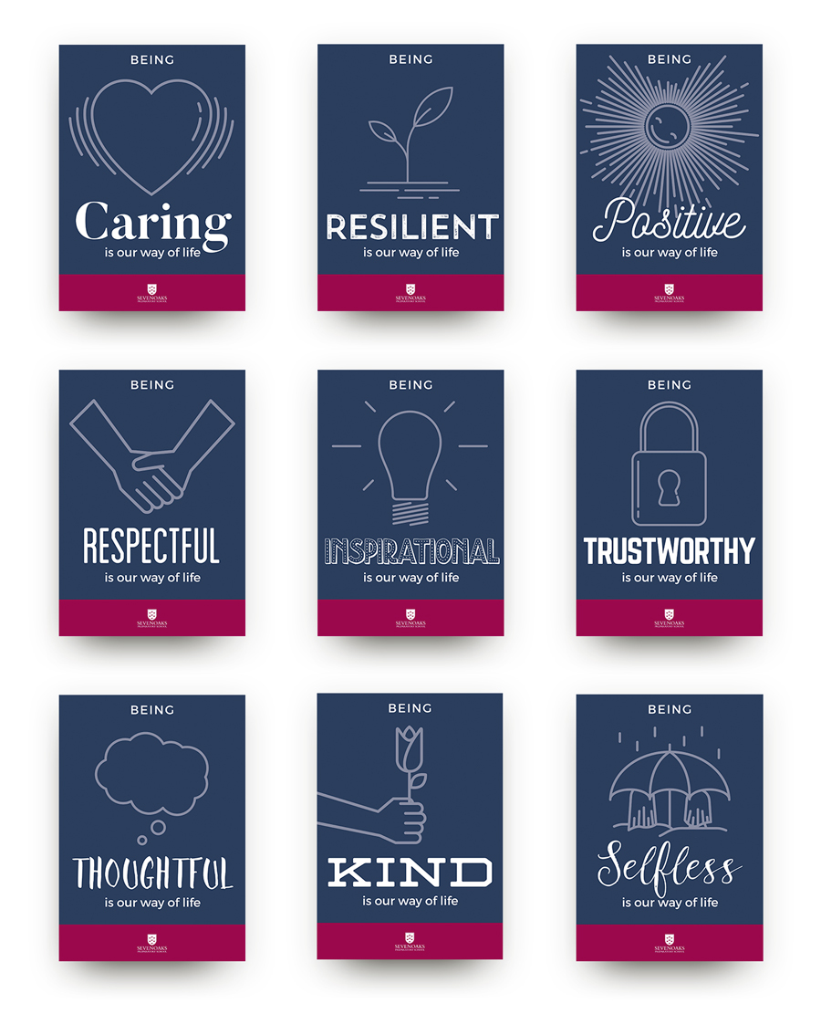
Sevenoaks Preparatory School required the design of nine unique signs that would be displayed throughout the schools grounds, showcasing the schools core principles and their 'way of life'.
The signs had to reflect brand guidelines, whilst also having a fun and energetic style that would resonate with the children. Illustrations were key to grabbing the children's attention coupled with a typeface that demonstrates the particular signs principle/value. To conclude the individual designs, a larger sign was created that showcased all of the core principles in one place, using the schools symbolic oak tree as the primary artwork.
We feel we hit the nail on the head with the signs, their concept and style, a combination of a professional, yet friendly feel. Let the signs do the talking!
Check out the Redspa Behance page to see more designs.


