Danielle Honey
Brand identity design
Danielle approached us with a request for a new brand identity for her business as a hair and makeup artist.
Categories: Graphic Design/
Branding
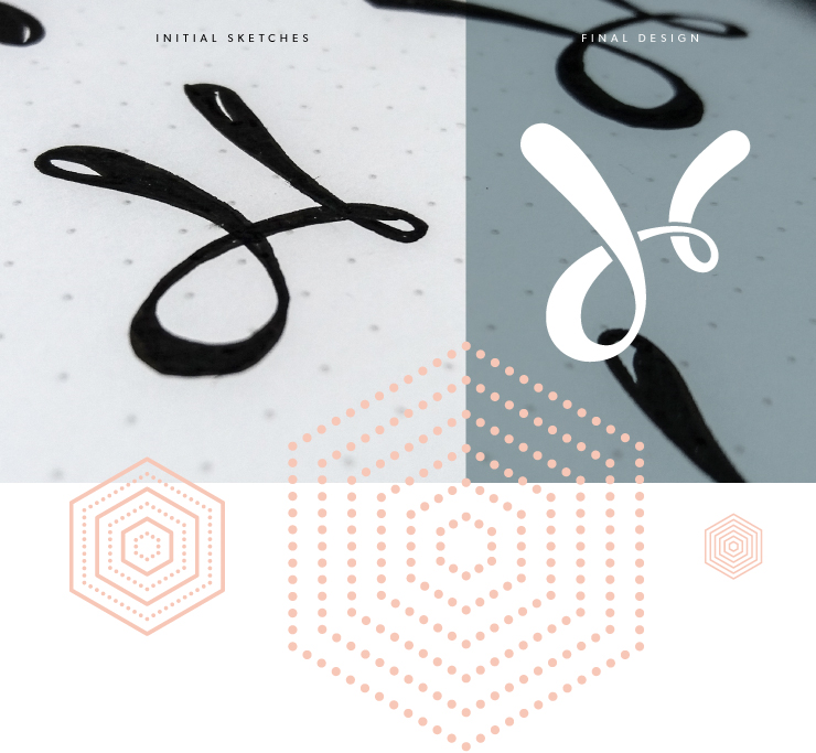
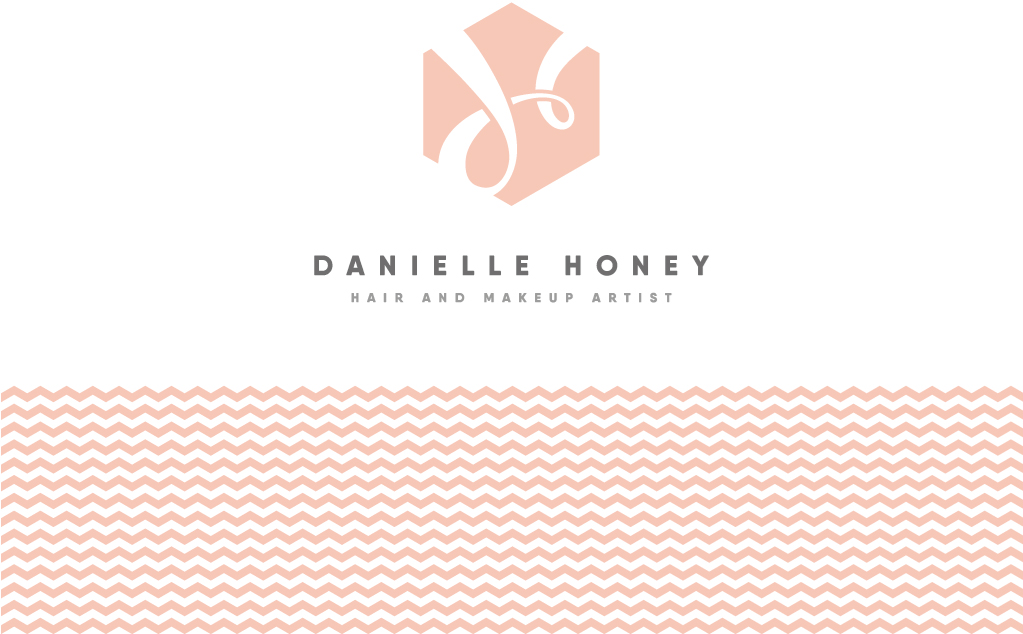
Danielle's brief was to keep the brand design clean and subtle, incorporating some form of honeycomb shape. From the initial sketches we had two chosen routes to follow. One of which was a looped 'dh' icon which we developed over a few phases, finally settling on placing the 'dh' within a honeycomb shape to create the final device. We paired that device with text set in an ExtraBold weight of the Qanelas Soft type family.
The final colour palette for Danielle's new identity is made up of five pastels, two of which are the main brand colours and three of which are secondary, designed to be used in conjunction with the primary colours.
Patterns
In addition to the logo, we created a number of different geometric patterns and icons for Danielle to use throughout any future print or digital designs. These patterns have all been created using the honeycomb hexagon as a base.
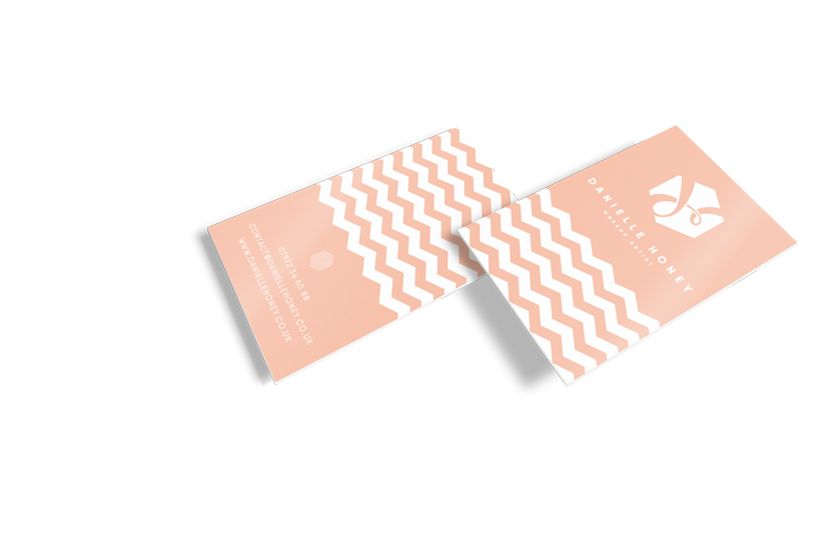
Business Cards
We designed and printed some business cards for Danielle. These were printed on 350gsm, matte stock and came in two different designs allowing Danielle to give the appropriate card out in specific situations.
